Components
Foreword
The following CSS variables can be declared globally and are used my multiple components:
--button-color- The color of buttons--button-font-color- The font color of buttons--selected-color- Color to indicate selected status (e.g. checkbox)--border-color- Color of borders (e.g. in anura-asset, anura-searchbar)--border-radius- Radius of borders (e.g. in anura-select, anura-searchbar)--counter-color- Color for counters (anura-tree, anura-select)--sidebar-width- Width of sidebars (and--sidebar-heightrespectively when in portrait mode)
Main Views
Main views display the assets, given scope defined by 1-n navigation components.
anura-gallery
View assets as a grid of thumbnails.
anura-table
View assets in tabular form.
anura-col
Dummy-component to configure table columns.
anura-map
View assets as pins on a map. Note that this component loads external dependencies (the map).
anura-slider
View assets as an image slider. Barely qualifies as a main view (purely visual, no downloads etc.).
Supporting elements
anura-asset
anura-lightbox
anura-details
anura-basket
anura-paginator
Navigation
Navigation components provide various methods to restrict the scope of displayed assets. In the end they all behave like an input element (e.g. they have a value and emit change events).
anura-searchbar

anura-select
anura-date
anura-number
anura-text
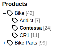
anura-tree
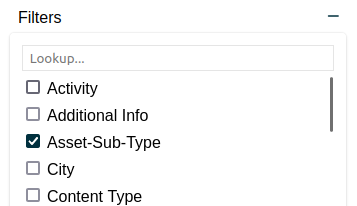
anura-filters
Ancillary Components
Small components that don't merit their own page.
anura-icon
A wrapper around the wonderful feathericons.com by @colebemis
Attributes
icon
required: yes, live: yes, default: -
Which icon from the feathericon set you with to display, e.g. folder.
toggle-icon
required: no, live: yes, default: -
Alternative icon to switch to when the component receives the toggled attribute
toggled
required: no, live: yes, default: not
Whether to switch to the toggled state, e.g. <anura-icon icon="square" toggle-icon="check-square" toggled>
loading
required: no, live: yes, default: not
Whether to switch to a loading animation, e.g. <anura-icon icon="book" loading>
Methods
getSvg(name)
Returns a particular SVG from the internal library.
setSvg(name, svg)
Override an existing (or register a new) SVG. Note that it must follow the feathericons.com layout, otherwise it might look weird.
This is probably best done via the whenDefined hook from customElements:
customElements.whenDefined('anura-icon').then(AnuraIcon => {
  AnuraIcon.setSvg('download', '<path d="M10.29 3.86L1.82 18a2 2 0 0 0 1.71 3h16.94a2 2 0 0 0 1.71-3L13.71 3.86a2 2 0 0 0-3.42 0z"></path><line x1="12" y1="9" x2="12" y2="13"></line><line x1="12" y1="17" x2="12.01" y2="17"></line>');
});
anura-counter
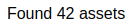
Tiny component to show the number of assets that a given main view has to offer (regardless of pagination).
If you want to adjust the wording, the translation keys are resultCount0, resultCount1 and resultCountN (this one takes a {count}).
Attributes
parent
required: yes, live: yes, default: -
The parent component to listen to, e.g. anura-gallery
number-only
required: no, live: yes, default: false
Set this to true to exclusively show the count, without any surrounding text.
count-selected
required: no, live: yes, default: true
When using the checkbox feature on assets, also show how many assets are currently selected.
E.g.: "Found 1337 assets, 3 selected"
multi-select
required: no, live: on-change, default: none
When using count-selected, offer buttons to select all or none
basket
required: no, live: yes, default: -
When using count-selected, set the basket and offer a button to add all them - needs to be querySelect-able.
Slots
- prefix - content that should appear before the count
- suffix - content that should appear after the count
Parts
<span part="counter-count"></span>
<span part="counter-select"></span>
anura-reset
A simple reset button, designed to reset all known anura- navigational components.
<anura-reset adapter="some-adapter" target="aside > *"></anura-reset>
Hold down Shift + Ctrl to also clear the local storage and state attributes, and then reload the page.
Attributes
adapter
required: yes, live: no, default: -
With which adapter to talk to (to load the values from)
target
required: yes, live: on-load, default: -
Whom to reset when clicked. Must be a querySelector-able expression, auch as #my-filter-1, #my-filter-2 or simply all from a parent like aside > *
Parts
<button part="reset-button">
    <anura-icon part="reset-icon"></anura-icon>
    <span part="reset-text"></span>
</button>
anura-injector
Extremely basic component that appends the content of its default slot to the specified target. This is useful when you don't have control over the entire layout of the page that you are using Anura in, e.g. some CMS may only allow you to add content in the main part, but you may want to add something to the sidebar.
Attributes
target
required: yes, live: yes, default: -
Selector for the injection target, e.g. #sidebar.
Slots
The unnamed default slot.
Example
<anura-injector target="#sidebar">
  <anura-searchbar adapter="some-adapter"></anura-searchbar>
  <anura-select adapter="some-adapter" source="produktkategorie"></anura-select>
  <anura-select adapter="some-adapter" source="Content-Type"></anura-select>
  <anura-select adapter="some-adapter" source="verwendungszweck"></anura-select>
</anura-injector>
anura-loader
Fullscreen blocker until the configured main view receives its first anura-loaded event. Should be added as early as possible on the page.
Attributes
main-view
required: yes, live: yes, default: -
Selector for the main view(s), e.g. #my-gallery.
Slots
The unnamed default slot, e.g. to add a logo.
Example
<anura-loader main-view="#my-gallery">
    <img src="my-logo.png" alt="logo">
</anura-loader>
anura-modal
A simple modal dialog for you to put stuff into (such as a greeting).
Attributes
open
required: no, live: on-load, default: -
Whether the modal should be open initially.
<anura-modal open></anura-modal>
once
required: no, live: on-load, default: -
When open is active, only open the modal once. You must set an id for that to work.
<anura-modal id="my-modal" open once></anura-modal>
trigger
required: no, live: yes, default: -
Convenience feature to set what triggers this modal to open (on-click).
<anura-modal trigger="#my-button"></anura-modal>
Slots
- default (unnamed) slot for your content
title- to give the modal a titlefooter- adds a footer for custom content, e.g. a button
Examples
<anura-modal open>
  <span slot="title">Hi there!</span>

  Greetings and welcome to this page!
</anura-modal>
© brix Solutions AG