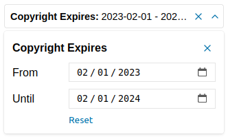
anura-date
<anura-date adapter="some-adapter" source="123"></anura-date>A date range selector

Attributes
adapter
required: yes, live: no, default: -
With which adapter to talk to (to load the values from)
<anura-date adapter="#my-adapter"></anura-date>
source
required: yes, live: on-load, default: -
What metadata field to query in order to get the possible values from. The value type will depend on the adapter that you're using (usually an ID or a UUID)
<anura-date source="my-date"></anura-date>
min
required: no, live: yes, default: -
Minimum date available, applied to the from field
<anura-date min="1900-01-01"></anura-date>
max
required: no, live: yes, default: -
Maximum date available, applied to the to field
<anura-date max="2030-01-01"></anura-date>
decade-min
required: no, live: yes, default: -
Activated the decade mode - minimum decade date available, applied to the decade field
<anura-date decade-min="1900"></anura-date>
decade-max
required: no, live: yes, default: current year
Maximum date available, applied to the decade field
<anura-date decade-max="2030"></anura-date>
value
required: no, live: set by component, default: -
The value deriving from both date inputs in the form of from,to, e.g. 2023-01-01,2023-12-31. Can be used to set an initial value, but will only be written to by the component afterwards.
type
required: no, live: set by component, default: -
The type of field that should be affected. This will be set by your adapter and is specific to the implementation. Don't touch this.
state
required: no, live: on-load, default: true
Whether the date fields should maintain their state. This will use the components id to differentiate itself from other components.
If you don't provide an ID, a hash of the component will be used. Set it to false to not keep any state at all.
<anura-date state="false"></anura-date>
drill-down
required: no, live: on-load, default: false
When enabled, these date values will become clickable in <anura-details>, whereafter this field will be filled with said date, and trigger a search.
Basically, this imitates the behaviour of <anura-select> for drill-down searches, but for date fields. It's off by default, as it makes litte sense for things like a description.
<anura-date drill-down></anura-date>
You may also target a different field by setting the field's ID as:
<anura-date drill-down="some-other-id"></anura-date>
Events
change
standard change event
Fired when the user selects values in the dropdown
Parts
<header part="header">
    <span part="header-title"></span>
    <span part="header-value"></span>
    <button part="date-button header-clear">
        <anura-icon part="header-icon header-icon-clear"></anura-icon>
    </button>
    <button part="date-button header-toggle">
        <anura-icon part="header-icon header-icon-toggle"></anura-icon>
    </button>
</header>
<fieldset part="fieldset">
    <div part="fieldset-title">
        <label part="fieldset-label"></label>
        <button part="date-button fieldset-close">
            <anura-icon part="date-icon date-icon-close"></anura-icon>
        </button>
    </div>
    <div part="fieldset-body">
        <label part="date-label date-label-from"></label>
        <input part="date-input date-input-from">
        <label part="date-label date-label-to"></label>
        <input part="date-input date-input-to">
        <button part="fieldset-reset"></button>
    </div>
</fieldset>
© brix Solutions AG