Anura Webcomponents
A rewrite of Anura from the ground up using webcomponents. No jQuery, no dependencies, just plain ES6. Goals:
- framework-agnostic (no node, no angular, no react)
- source-agnostic (work with multiple DAM systems)
- furthermore, it should be
- easy to integrate
- accessible
- responsive
Internet Explorer is NOT supported anymore. If you need that, use the jQuery one (and may god have mercy upon your soul)
Demo
See https://anura.brix.ch/webcomponents.
Installation
Anura is available via
- git submodule (ask us for a user)
git submodule add https://gitlab.brix.ch/brix/celum/anura/webcomponents.git lib/anura(you may prefer to use tags, main is "bleeding-edge")- and to update
git submodule update --remote
- npm
npm i anura-webcomponents
- unpkg CDN
<script type="module" src="https://unpkg.com/anura-webcomponents/src/adapters/$DAM-adapter.js"></script><script type="module" src="https://unpkg.com/anura-webcomponents/src/components/anura-components.js"></script>
Usage
In your index.html (or a CMS page), import at least the following two lines (use the <head> if you can, otherwise lead with it).
Replace $DAM with bynder, celum, pixxio or sharedien!
<head>
  <script type="module" src="lib/anura/src/adapters/$DAM-adapter.js"></script>
  <script type="module" src="lib/anura/src/components/anura-components.js"></script>
</head>
Instead of loading all components via anura-components.js, you might only want to load the ones you need, e.g. anura-gallery.js (it will take care of its dependencies).
Introduction
Webcomponents are declarative, so where before you needed custom Javascript, you now just declare that you want a gallery:
<anura-gallery node="123"></anura-gallery>In order to abstract away the source of your assets, the concept of adapters exists. These hold common settings (such as the URL) and know how to talk to their DAM. They are hooked up as follows:
<some-adapter url="https://my.server.com/anura/example" locale="de"></some-adapter>
<anura-gallery adapter="some-adapter" node="123"></anura-gallery>
Note that you can update locale at runtime, and the gallery will reload itself to reflect that change.
To use multiple adapters at the same time: give them an ID like id=my-id, and refer to them as adapter="#my-id".
The same applies to hooking up different components to one another. Here's an example with a navigation tree:
<some-adapter url="https://my.server.com/anura/example" locale="de"></some-adapter>
<div style="display: flex">
    <anura-tree adapter="some-adapter" root="1337"></anura-tree>
    <anura-gallery adapter="some-adapter" search="anura-tree"></anura-gallery>
</div>
The tree is configured as the search component for the gallery, so it will now listen to navigation events and update itself.

Page Anatomy
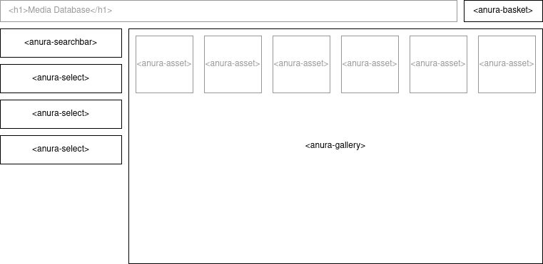
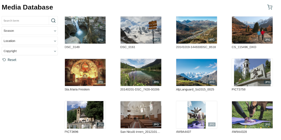
When composing your own anura page, you will use a variety of different anura components, which you can mix-and-match alongside regular HTML as you see fit. For example:

Using just 4 different anura-components, we can simply create an easy-to-use media browsing experience - anywhere in the web!

In order for this to work, we need to hook them up to one another like so (note the adapter and source attributes):
<html lang="en">
<head>
    <script type="module" src="adapters/some-adapter.js"></script>
    <script type="module" src="components/anura-*.js"></script><!-- more imports here -->
    <!-- style omitted for brevity -->
</head>
<body>
    <header>
        <h1>Media Database</h1>
        <anura-basket adapter="some-adapter"></anura-basket>
    </header>

    <some-adapter url="https://some.place"></some-adapter>

    <aside>
        <anura-searchbar adapter="some-adapter"></anura-searchbar>
        <anura-select adapter="some-adapter" source="Season"></anura-select>
        <anura-select adapter="some-adapter" source="Location"></anura-select>
        <anura-select adapter="some-adapter" source="Copyright"></anura-select>
    </aside>
    <main>
        <anura-gallery adapter="some-adapter" search="anura-searchbar,anura-select" basket="anura-basket"></anura-gallery>
    </main>
</body>
</html>
Also note how components can contain other components, such as <anura-asset> inside the gallery (done automatically, unless you specify something else in that slot).
Component Anatomy
Every component usually has:
- Attributes: HTML attributes on component-level, such as
locale="de"that can be updated "live" at any time. These can either be configured, or they appear as a result of an interaction, e.g. anura-tree will update itsvalueattribute when a node has been selected. - Events: Emitted (or consumed) when something interactive happens, e.g. clicking on a node anura-tree yields a node-selected-event.
- Slots: Places to add you own HTML into the component, e.g. anura-tree has a slot for a title, so you can
<anura-tree><h3 slot="title">my custom title</h3></anura-tree>. - Parts: Named parts of components that are available for styling, e.g.
anura-gallery::part(asset-title) { color: #f00 }to make an assets title red. Note that unnamed shadow DOM objects are not styleable (by design). - Variables: CSS-variables allow you to specify some global default, without having to touch each
part, e.g.--button-color: blue.
AnuraQuery.selector
As of 1.3, Anura ships with a custom querySelector, designed for accessing components from within other components, or the other way around. This facilitates abstracting page integrations into a web component of their own, wherein you couldn't use search from the example above, as it'd be shielded by the shadowRoot (i.e. document.querySelector wouldn't find anything). The following syntax is supported:
<<<to break out, e.g.<<< #something-outsidebreaks out of the web component, andquerySelectors at every shadowRoot boundary, until having reacheddocument.>>>to break in, e.g.>>> anura-something >>> #further-downbreaks into the web component, allowing you to address (or even access) internal things. shadowRoots are traversed transparently, but you'll need to drill down explicitly into each web component along the way.<<< break-out-first >>> then-break-inis also supported, should things ever get that hairy.
This is a bit naughty and will only work if the web components use mode: open, which is the default. If you programmatically mess around inside of anura components and it breaks, you get to keep both pieces.
Integration
In the Introduction we said that we can change the locale at runtime (or any other attribute marked live: yes). Let's do that:
In JavaScript
Example: change the locale attribute using an regular dropdown:
<some-adapter locale="de"></some-adapter>

<label for="demo">Language</label>
<select id="demo" onchange="document.querySelector('some-adapter').setAttribute('locale', event.target.value)">
    <option value="de" selected>Deutsch</option>
    <option value="en">English</option>
</select>
In Angular
Example: change the locale attribute using an external dropdown (mat-select in this case):
<some-adapter [attr.locale]="selectedLanguage"></some-adapter>

<mat-form-field appearance="fill">
  <mat-label>Language</mat-label>
  <mat-select [(value)]="selectedLanguage">
    <mat-option value="de">Deutsch</mat-option>
    <mat-option value="en">English</mat-option>
  </mat-select>
</mat-form-field>