anura-basket
<anura-basket adapter="some-adapter"></anura-basket>
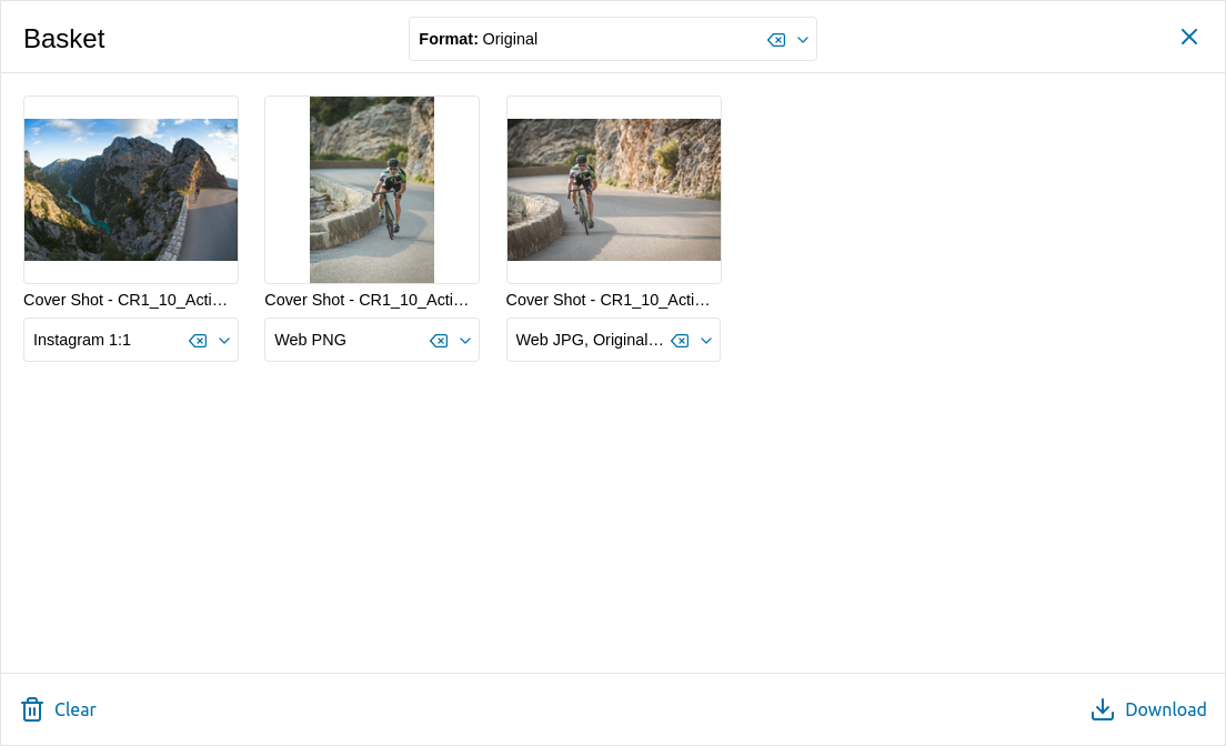
The basket is a temporary collection of assets to be downloaded at once. It is persistent during page reloads, and even across different pages - provided you give it the same ID.
Once opened, the user may select different download formats for each asset, or set them globally through the select at the top. Also supports showing Terms of Use (optional).

Variables
--basket-sidebar-widthoverriding--sidebar-width(or--basket-sidebar-heightrespectively when in portrait mode)--basket-coloroverriding--button-color--basket-font-coloroverriding--button-font-color--basket-backgroundoverridingwhite
Attributes
adapter
required: yes, live: no, default: -
With which adapter to talk to (to load the translations from).
<anura-basket adapter="#my-adapter"></anura-basket>
state
required: no, live: on-load, default: true
Whether the basket should maintain its state. This will use the components id to differentiate itself from other components.
If you don't provide an ID, a hash of the component will be used. Set it to false to not keep any state at all.
Your basket should have an
id=to use as a key in localStorage. Otherwise an instance key is generated, which may be subject to change.
<anura-basket state="false"></anura-basket>
terms-of-use
required: no, live: yes, default: false
Display terms of use as a sidebar (right above the download button). Use either the slot or the translation keys are termsOfUse for the title and termsOfUseContent for the content (accepts HTML).
Possible values
false- don't show anything (no sidebar, no button)true- show the sidebar, but provide a button to hide itforce- show the sidebar, without an option to hide it, and adds an "I agree"-checkbox that needs to be checked.hidden- hide the sidebar initially, but provide a button to show it
<anura-basket terms-of-use="force"></anura-basket>
default-format
required: no, live: on-change, default: -
The default download format that should be selected when an asset is added to the basket, e.g. Original. Note that when an asset does not offer that format, nothing will be selected.
<anura-basket default-format="Original"></anura-basket>
clear-on-download
required: no, live: yes, default: true
Whether the download basket should be cleared after a download has been triggered.
<anura-basket clear-on-download="false"></anura-basket>
buttons
required: no, live: on-load, default: clear,download
Which buttons to show in the footer. Known buttons:
clear- clears the basket's contentlink- copy a link to the current basket content to the clipboard (for sharing)order- when assets must be ordered first (depends on your DAM/settings)download- download tha basket's content
<anura-basket buttons="clear,link,download"></anura-basket>
format-selectors
required: no, live: on-load, default: true
Whether to show the download format selects - you may want to turn these off when not actually offering a real download (e.g. you are using assetOrder).
<anura-basket format-selectors="false"></anura-basket>
lightbox
required: no, live: yes, default: -
Where an instance of <anura-lightbox> can be found to display assets in, e.g. #my-lightbox.
<anura-basket lightbox="false"></anura-basket>
max
required: no, live: yes, default: 0
The maximum number of assets that can be put into the basket, whereafter new assets will be discarded. Values below 1 will disable this feature.
<anura-basket max="500"></anura-basket>
single-select
required: only for pixx.io, live: yes, default: 0
Restrict the download selectors to a singular selection. This only makes sense if your DAM does not support multiple different download format requests.
<anura-basket single-select></anura-basket>
Events
basket-added
{details: {asset: asset}}
When an asset has been added to the basket.
basket-removed
{details: {assetId: id}}
When an asset has been removed from the basket.
basket-cleared
When the basket has been cleared.
basket-download
{details: {assets: assets}}
When assets have been downloaded from the basket - details contain a map of IDs to a set of selected download formats.
basket-counter
{details: {count: count}}
Whenever the basket updates (add/remove/clear), signals the number of assets that are currently in the basket.
Slots
-
asset - configure your own asset. Default is
<anura-asset>with an<anura-select>in the content slot (for selecting the desired formats) - this is required should you override this:<anura-asset buttons="basket"> <anura-select slot="content" filter="false" hide-title="true"></anura-select> </anura-asset> -
terms-of-use - override the default sidebar with your own content, default is:
<h3 part="basket-sidebar-title"></h3>
<span part="basket-sidebar-content"></span>
Parts
<button part="basket-button basket-button-main">
  <anura-icon part="basket-icon"></anura-icon>
  <span part="basket-counter"></span>
</button>

<div part="basket-overlay">
  <div part="basket-container">
    <nav part="basket-header">
      <span part="basket-title"></span>
      <anura-select part="basket-global-select"></anura-select>
      <div part="basket-buttons">
        <button part="basket-button basket-button-close">
          <anura-icon part="basket-icon basket-icon-close"></anura-icon>
        </button>
        <!-- more buttons -->
      </div>
    </nav>
    <div part="basket-body">
        <main part="basket-content">
            <!-- <anura-assets part="basket-asset"> in here -->
        </main>
        <aside part="basket-sidebar"></aside>
    </div>
    <nav part="basket-footer">
      <button part="basket-button basket-button-download">
        <anura-icon part="basket-icon basket-icon-download"></anura-icon>
        <span part="basket-label basket-label-download"></span>
      </button>
        <!-- more buttons -->
    </nav>
  </div>
</div>
© brix Solutions AG