anura-table
<anura-table adapter="some-adapter" search="anura-tree">
    <anura-col name="thumbnail"></anura-col>
    <anura-col name="assetName" sort="name"></anura-col>
    <anura-col name="metadata-123" width="20%"></anura-col>
    <anura-col name="buttons"></anura-col>
</anura-table>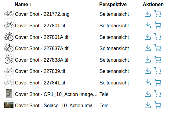
By default, the table has 3 columns (thumbnail, assetName, actions) and an <anura-paginator> at the bottom.
Attributes
adapter
required: yes, live: no, default: -
With which adapter to talk to (for translations and suggestions)
<anura-table adapter="#my-adapter"></anura-table>
columns
required: probably, live: on-load, default:
thumbnail,assetName,actions
What columns to show. Note that this offers no way of customizing the columns -> define anura-cols instead for more control.
<anura-table columns="thumbnail,assetName"></anura-table>
search
required: when no node is provided, live: yes, default: -
Which component the table should get its instructions from, e.g.:
anura-treeanura-searchbaranura-select
You can combine multiple search components, e.g. anura-tree,anura-searchbar, which will be ANDed together. Depending on where they live, you may use a selector such as aside > *.
<anura-table search="#sidebar > *"></anura-table>
node
required: when no search is provided, live: yes, default: -
The content of which node that the table should display. This will cause the gallery to ask its adapter for the content of said node.
<anura-table node="4123"></anura-table>
sort
required: no, live: yes, default: -
How the displayed assets should be sorted by default, ending in either _asc or _desc. The exact wording will depend on your adapter, e.g. name_asc. Known values:
- Bynder:
name, dateCreated, dateModified, datePublished - CELUM:
id, name, uploaddate, lastmodified, extension, assettype, score, original(name), (file)size, info_{id}, default isid - Sharedien:
relevance, file_name, system_import_date, default isrelevance
<anura-table sort="uploaddate_desc"></anura-table>
page-size
required: no, live: on-load, default: 50
How many assets should be displayed at once on a page.
<anura-table page-size="42"></anura-table>
basket
required: no, live: yes, default: -
Where an instance of <anura-basket> can be found to collect assets in, e.g. #my-basket. Attempts auto-detection of anura-basket
<anura-table basket="#my-basket"></anura-table>
quick-download
required: no, live: on-load, default: -
Which download format to use for the quick download button, e.g. Original. NOT RECOMMENDED, specifying nothing makes an download format selector appear.
<anura-table quick-download="6"></anura-table>
lightbox
required: no, live: yes, default: creates one
Where an instance of <anura-lightbox> can be found to display assets in, e.g. #my-lightbox. When none is provided or detected, a "blank" lightbox will be appended to the body. This can be prevented by passing lightbox="false", in which case nothing will happen.
<anura-table lightbox="#my-lightbox"></anura-table>
buttons
required: no, live: on-load, default: 'download,basket'
Which buttons to show in the buttons column, and in what order. Known values are checkbox, download and basket (requires basket to be set).
This is a top-level attribute (instead of on the anura-col) for consistency across other components.
<anura-table buttons="basket"></anura-table>
sticky-header
required: no, live: yes, default: false
Whether the table header should be sticky when scrolling.
--table-stiky-offsetmay be used to set a vertical offset for a sticky header--table-header-colorshould be set to the page's background color
<anura-table sticky-header></anura-table>
mobile-cards
required: no, live: yes, default: true
Whether the table rows should expand to a card-like view on mobile for better legibility.
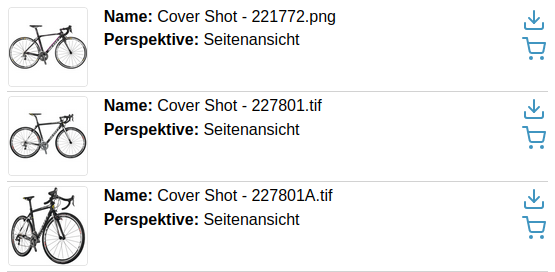
Note that this assumes (via grid-template-columns) that you have thumbnail- and action-columns enabled.
<anura-table mobile-cards="false"></anura-table>
mobile-labels
required: no, live: yes, default: true
When using mobile-cards, display the former table headers as prefixes in the vertical view, e.g. "Perspektive: Seitenansicht" instead of just "Seitenansicht".
<anura-table mobile-labels="false"></anura-table>
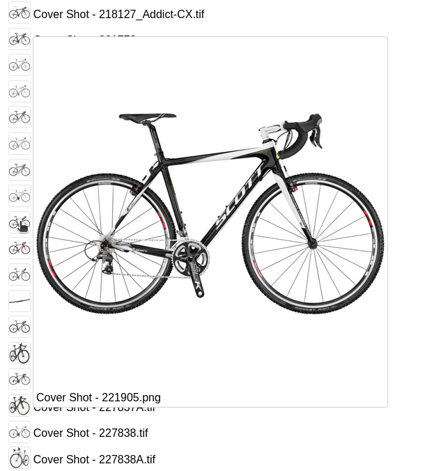
hover-preview
required: no, live: on-load, default: -
Whether to enable a hover-preview when the mouse hovers over the thumbnail.
--hover-max-widthand--hover-max-heightdefault to 500px
<anura-table hover-preview></anura-table>
resizeable
required: no, live: on-load, default: -
Whether to offer resize handles on columns. Note that the tracking may not match up 1:1 with the mouse movement due to the table layout being fixed.
<anura-table resizeable></anura-table>

Variables
--thumbnail-border-radiusinherits from--border-radius--thumbnail-background-colordefaults to transparent--hover-colorthe accent color for the row the mouse is hovering over
Events
assets-loading
{details: {node: nodeId, search: search-terms, keepContent: bool, pageRequest: pageRequest}}
When the gallery is loading new assets, either through a node or a search request. A good time to clear counters and such.
assets-loaded
{details: {total: totalCount, assets: AnuraAsset[], pageRequest: pageRequest}}
When assets have been loaded (through whatever mechanism), informs other components (such as anura-paginator) about the total number of assets, the new assets themselves, as well as the pageRequest (contains current paging information).
asset-added
{details: {asset: assetData, instance: trInstance}}
When an individual <tr> has been added to the table. Useful when you want to tweak something.
paginate (inbound)
pageNumber
Instruct anura-gallery to display the provided page number - used by anura-paginator to tell the gallery to advance to an arbitrary page. Note that the page number is currently not validated, so sending a non-existent page number may lead to undefined behaviour.
asset-details
{details: {asset: assetData}}
When an individual anura-asset has been clicked on. By default this triggers the <anura-lightbox> unless lightbox="false" is set.
Slots
-
header - the header slot will appear before the table.
-
footer - the footer slot will appear at the very end.
-
paginator - configure your own paginator. Default is
<anura-paginator><anura-table adapter="some-adapter"> <anura-paginator slot="paginator" mode="auto" detect-scroll="false"></anura-paginator> </anura-table>
When using the built-in components, the part selector might be
anura-gallery::part(paginator-button), but when you declare your own it changes toanura-paginator::part(paginator-button), as it is no longer part of the gallery.
Parts
<table part="asset-container">
    <colgroup part="table-colgroup">
      <col part="anura-col-$name anura-col-at-$index">
    </colgroup>
    <thead part="table-thead">
        <tr part="table-thead-tr">
          <th part="anura-th-$name anura-th-at-$index"></th>
        </tr>
    </thead>
    <tbody part="table-tbody"></tbody>
</table>
<slot id="column-template"></slot>
<figure part="table-previewer">
    <img part="table-previewer-image">
    <figcaption part="table-previewer-caption"></figcaption>
</figure>
<slot name="paginator"></slot>
anura-col
Just a configuration object to define column properties for anura-table
- name - what column to show. Built-in are
thumbnail,assetNameandbuttons(formerlyactions). - sort - indicate that this field is sortable, and what its sort-key is (as this depends on your DAM), e.g.
sort="name"will set the sort order toname_asc/name_descwhen the column header is clicked. More fine-grained control is available through the sort-asc and sort-desc properties, e.g.<anura-col sort-asc="upwards" sort-desc="downwards">(again, depending on your DAM). - title - override the title (either built-in or fetched from the name of the metadata field on display)
- title-{locale} - override the title for a given locale, e.g.
title-en="Hi" title-de="Hallo"
- title-{locale} - override the title for a given locale, e.g.
- width - how wide the column should be (any CSS unit), defaults to
auto. - style - for convenience, e.g.
text-align: endfor numbers - postprocessor - name of a postprocessor that should be applied to the cell content. Known implementations:
markdown- render the cell's text as Markdowndate- treat the cell as a date and format it (depends on your DAM) - reads an attributedate-formatwhich must contain a valid format, default isyyyy-mm-dd HH:MM:ssbytes- if you need to control how the file size is formatted - reads an attributedecimalscontrols the decimal precision, e.g. 2 => 2.47 MB, 0 => 2 MB, default is 2link- scans plain text for possible hyperlinks (https?://..., e-mail address, international telephone number) and converts them to real hyperlinks
Example
<some-adapter url="https://some.where" infofields="128,107,160"></some-adapter>

<anura-table adapter="some-adapter" sort="name_asc">
    <anura-col name="thumbnail"></anura-col>
    <anura-col name="assetName" sort="name" title="Demo"></anura-col>
    <anura-col name="metadata-128" width="15%"></anura-col>
    <anura-col name="metadata-107" width="10%" sort="info_107" postprocessor="date" date-format="yy/mm"></anura-col>
    <anura-col name="metadata-160" width="50%" postprocessor="markdown"></anura-col>
    <anura-col name="buttons"></anura-col>
</anura-table>
String interpolation
If you want to customize the content of a particular <anura-col>, you have full access to the string interpolation features, e.g. show an icon in front of the asset name based on a checkbox:
<anura-col name="assetName" sort="name">
    <img if="${asset.metadata[110].rawValue}" equals="true" src="https://www.brix.ch/assets/theme/images/favicon/favicon-16x16.png">
    <span>${asset.name}</span>
</anura-col>
© brix Solutions AG