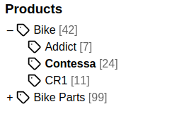
anura-tree
<anura-tree adapter="some-adapter" root="1337" icon="tag"></anura-tree>Basic navigation tree, featuring automatic (based on selection) and manual folding of sub-trees.

Attributes
adapter
required: yes, live: yes, default: -
The adapter that this tree should talk to.
root
required: yes, live: yes, default: -, alias: root-node
The root node of your navigation (ID or String).
<anura-tree root="123"></anura-tree>
Bynder doesn't support folder structures, so collections used are instead when providing
root="collections"
value
required: no, live: once, default: -
Which node in the tree should be selected initially. Subsequent selections by the user are reflected in this attribute, but are write-only after the initial load. Note that the state parameter node will override the initial selection.
fallback
required: no, live: on-load, default: -
Value to use when nothing is selected. May be "root" to use the tree's root node. Note that configuring a sub-node of the root works, but results in an odd UX.
icon
required: no, live: yes, default: 'folder'
The icon that each node in the tree should display (see anura-icon). Pass false to hide these icons.
<anura-tree icon="archive"></anura-tree>
depth
required: no, live: no, default: -
To what depth the tree should load subnodes.
<anura-tree depth="3"></anura-tree>
deselectable
required: no, live: no, default: -
Whether to allow a user to deselect a previously selected node. Otherwise the user can only change the selection.
<anura-tree deselectable></anura-tree>
show-count
required: no, live: no, default: -
Whether to show a count of how many items are in this node (provided your adapter supports this).
hide-empty
required: no, live: no, default: -
Whether to hide nodes that have a count of 0 (provided your adapter supports this).
title
required: no, live: yes, default: name of root node
Set a custom title, rather than the name of the root node.
<anura-tree title="a fancy tree"></anura-tree>
state
required: no, live: no, default: true
Whether to update the URL to persist the currently selected node (for sharing the link). This will use the components id to differentiate itself from other components.
If you don't provide an ID, a hash of the component will be used. Set it to false to not keep any state at all.
<anura-tree state="false"></anura-tree>
hide
required: no, live: no, default: []
Comma-separated list of node IDs that you wish to hide (does not render them at all). You should use the DAMs permission system to achieve this, but if for some reason you can't, this is an option.
<anura-tree hide="123,456,789"></anura-tree>
node-type
required: no, live: yes, default: -
Which node type you wish to load. Usually not necessary, as an ID should be unique - it depends on your DAM (may be required to show all root nodes on the first level).
<anura-tree node-type="105"></anura-tree>
category-lookup
required: no, live: no, default: -
Whether to offer a lookup functionality for categories/nodes/folders by name. This replaces the tree with a list of matching items. Availability depends on your DAM.
<anura-tree category-lookup></anura-tree>
marker
required: no, live: yes, default: +/-
Change the way that the list icon markers (open/closed) look, one of triangle ▹, full-triangle ▸ or none
<anura-tree marker="triangle"></anura-tree>
folded
required: no, live: yes, default: -
Whether the tree should initially be folded. Note that a selected node will unfold the tree automatically.
<anura-tree folded></anura-tree>
disable-autoscroll
required: no, live: yes, default: -
Whether to prevent the tree from automatically scrollIntoView to the selected node (e.g. when entering via a deep link).
<anura-tree disable-autoscroll></anura-tree>
Events
change
regular change event
node-clicked
{detail: {id: node.id, name: node.name}}
Fired whenever the user has clicked on a node, regardless whether a selection or a deselection has occurred.
node-selected
{detail: {id: node.id, name: node.name}}
Fired whenever the user has selected a node. This will also update the selected attribute of the component.
node-deselected
{detail: {id: node.id, name: node.name}}
Fired whenever the user has deselected a node. This will also remove selected attribute from the component.
Slots
-
header - the header slot will appear before the title and tree content.
-
footer - he footer slot will appear at the very end, after the tree content.
Parts
<ul part="tree-root">
    <li part="node-li">
        <a part="node-link">
            <anura-icon part="node-icon"></anura-icon>
            <span part="node-name">Wheel</span>
            <span part="node-counter">42</span>
        </a>
        <ul part="node-ul"><!-- snip, repeats inside --></ul>
    </li>
    <li><!-- snip, etc. --></li>
</ul>
E.g. color all the icons in the tree:
anura-tree::part(node-icon) { color: green; }© brix Solutions AG