Navigation
This is the old front-end written in jQuery. Please consider upgrading to Webcomponents. We will still maintain this version, but new features will only be added to the new one.
Tree
Please use anura-tree instead
Options
server
type: URL, required: yes, default: -
The endpoint to use, e.g. http://your.celum.server/anura/first
locale
type: String, required: no, default: CELUM's default language
The locale (ISO 639-1) to use, i.e. en. The availability of these depend on your CELUM configuration, usually en, de or fr. When left empty, CELUM's default language will be used.
node
type: Object, required: yes, default:
{kind: 101, id: 0}
The root node of your tree, i.e. {kind: 103, id: 1337}. Note that since CELUM 5, the kind-parameter is no longer required unless you set the ID to -1.
node.kind
type: long, required: only when node.id = -1, default: 101
The NodeTypeId of the desired node. Traditionally folder = 101, collection = 102 and keywords = 103, but check your tabconfiguration.xml to be sure. Since CELUM 5 this is only required when you set the node.id to -1.
node.id
type: long or array of longs, required: if node is specified, default: 0
The NodeId of the root node(s). Also supports arrays, i.e. you can construct a "virtual root node" (to aggregate multiple nodes from different locations) by using {kind: ..., id: [1, 2, 3]}. Can also be set to -1 to get all root nodes as long as a kind is provided (enforces show_root=true; since 1.7).
show_root
type: boolean, required: no, default: false
Also show the root node(s) themselves (usually only the child nodes are shown). Probably only useful for virtual root nodes.
show
type: mixed, required: no, default: false
What to show after the tree has been loaded (triggers an attached main view). One of:
'first' or true- show the first leaf node in the tree'last'- show the last leaf node in the tree4123- an arbitrary ID of a node in the tree
depth
type: int, required no, default: 0
Depth to which the tree should be loaded (lazy loading). A depth smaller than one loads the entire tree.
state
type: String, required: no, default: ''
Prefix for the state fragment in the URL (only needed for multi-instance). Set to false to completely disable state (deep linking through updating the URL fragment)
asset_count
type: boolean, required: no, default: false
If the number of assets in each node should be shown. Has some persormance implications for large trees, as every subnode has to be queried individually. Note that if you're using noderef in your main view, you need to also configure noderef: true here for consistent results.
hide_empty
type: boolean, required: no, default: false
Whether to hide nodes that have an asset_count of 0. Setting this to true automatically sets asset_count: true.
sort
type: function or String, required: no, default: null
How the tree should be sorted (per level). Can be either one of id_asc, name_asc, info_asc (or ..._desc) of a custom comparison function, see MDN
callback
type: function, required: I'd recommend it, default: see below
What should happen when a user clicks on a node in the tree. By default it tries to find the next best gallery component:
callback: function(server, kind, id, name) {
    $('.anura-gallery-container').first().parent().anuraGallery({server: server, assets: null, node: {kind: kind, id: id}});
}
If you don't use the gallery or want to be more efficient about it, your code will look something like:
var mainView = $('#your-main-view').anuraGallery({...});
var tree = $('#your-tree').anuraTree({
    /*... other settings ... */
    callback: function(server, kind, id, name) {
        mainView.anuraMasonry({server: server, assets: null, node: {kind: kind, id: id}});
    }
});
list_style
type: boolean, required: no, default: true
Whether to show the node state (● has subnodes, ○ has no subnodes, ■ lazy loaded) through list styles (since 2.2)
li_expander
type: boolean, required: no, default: false
Enable folding of the tree (regardless of the current selection) when clicking on the list style icons since 2.3
a_href_attr
type: String, required: no, default: null
Adds a custom href attribute to each item in the tree. This is an alternative to the callback, but it's not compatible with the _state_option. since 2.6
multiselect
type: boolean, required: no, default: false
Enables multi-select on the tree (through CTRL). This is probably only useful then used inside anuraSearch. since 2.7
Notes
- anuraTree can also be used as a horizontal navigation bar (with folding). Simply use jquery.anura.navbar.css instead of jquery.anura.tree.css (suitable for trees up to a depth of 3)
- Do not initialize the tree before the gallery component when using the show parameter or the URL-state, as this may lead to a race condition
Events
- anura-loaded (options, data) - triggered when the plugin has loaded all nodes
- anura-clicked (server, kind, id, name) - triggered when a user clicks on a node/leaf
- anura-reset - triggered when reset via anuraSearch
DOM
<div class="anura-tree-container">
   <ul>
      <li class="anura-node anura-active">
         <a><span class="anura-node-name">Parent Node</span></a>
         <ul class="anura-tree-unfolded">
            <li class="anura-node">
               <a><span class="anura-node-name">Child Node</span></a>
               <ul class="anura-tree-folded">
                  <li><!--etc--></li>
               </ul>
            </li>
            <li class="anura-leaf">
               <a><span class="anura-node-name">Child Leaf</span></a>
            </li>
         </ul>
      </li>
      <li class="anura-node"><!--etc--></li>
      <li class="anura-leaf"><!--etc--></li>
      <!--etc-->
   </ul>
</div>
Search
Options
Please use anura-select et al. instead
server
type: URL, required: yes, default: -
The endpoint to use, e.g. http://your.celum.server/anura/first
locale
type: String, required: no, default: CELUM's default language
The locale (ISO 639-1) to use, i.e. en. The availability of these depend on your CELUM configuration, usually en, de or fr. When left empty, CELUM's default language will be used.
callback
type: function, required: probably, default: auto-detect a gallery
What to do with the assembled search request, most likely to tell a main view to load that content.
var main = $('#main').anuraGallery(/*...*/);
var search = $('#search').anuraSearch({/*...*/,
    callback: function (server, search_query) {
        main.anuraGallery({server: server, search: {custom: search_query}, locale: lang});
    }
});
widgets
type: array of objects, required: yes, default: text and filetype
What search widgets to offer to the user.
General options:
- title, String or map like
{de: 'German Title', en: 'English Title'}to override the widget's default title - autosubmit (boolean), whether to immediately trigger a search when the widget's value changes
- container_class (String), override the global container_class setting for this specific widget
load chosen.js for pretty dropdowns, it's supported out-of-the-box
Available widgets:
text
{name: 'text'}- scope (optional), consumes a reference to an external anuraTree (preferably use an internal
treewidget instead)- checked (boolean), boolean, state of the checkbox toggling the limitation to said tree
- button (optional boolean), adds an extra 🔍-button next to the input field to trigger a search (instead of just listening for enter)
- resettable (optional boolean), adds an extra X-button to delete the content of the input field
filetype
{name: 'filetype', style: 'checkbox'}- style (
checkbox(default),radio,select,dropdown), how to present the input for the file types
assettype
{name: 'assettype', style: 'checkbox'}- style (
checkbox(default),radio,select,dropdown), how to present the input for the asset types
properties
{name: 'properties', uploaded: true, modified: true, size: false}- Query fields for additional properties, currently booleans for
uploaded,modifiedandsize
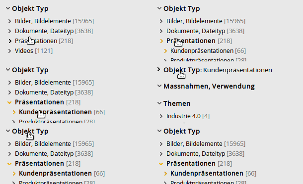
tree (or keywords)
{name: 'tree', root: 1337}- root (required long), the root node of the tree you want to show - requires anuraTree
- kind (optional long), the node type ID, only necessary then using
root: -1 - collapsible (optional boolean), whether the widget is collapsible
- collapsed (optional boolean), whether it's initially collapsed
- unselectable (optional boolean), whether a selected node can be un-selected again (pass
falseto suppress) - tree_settings (optional object), any additional tree settings offered by anuraTree
infofield
{name: 'infofield', id: 123}- id (required long), the ID of the information field you want to show
- style, how to display the input - availability depends on the type of the infofield
- Checkbox and Dropdown support
checkbox,radio,selectanddropdown - NodeRefs support
checkbox,radio,select,dropdown,treeandtext - additional widget option:
root_node(long) to set a different root node than the NodeRef's (needs to be a sub-node of that) - additional widget options when using
tree:recursive_toggle(recursivefor default),unselectableandtree_settings(see tree above) - additional widget options when using
dropdownorselect:depth(int) how many levels to load,sort('asc', 'desc', or function) to sort the values,indent(String) how to indent the levels inside the dropdown (default is ' ') - Numbers and Date use their respective inputs, but support the style
rangefor "from-to" searches - additional widget option:
placeholderto set a placeholder text - Text always uses a text input
- additional widget options:
placeholderto set a placeholder text,datalist(boolean) to suppress facet auto-complete
- Checkbox and Dropdown support
- collapsible (optional boolean), whether the widget is collapsible
- collapsed (optional boolean), whether it's initially collapsed
- default (optional), the default selection of this widget, type depends on the type of the infofield
when configuring a bunch of infofields, make use of
$.extendto not repeat identical setting
var info_template = {name: 'infofield', autosubmit: true, collapsible: false, style: 'select'};
var search = $('#anura-search').anuraSearch({
 /*...*/,
 widgets: [
     {name: 'text'},
     $.extend({}, info_template, {id: 102}), // brand
     $.extend({}, info_template, {id: 116, root_node: 10909}), // product
     $.extend({}, info_template, {id: 114}), // model year
     $.extend({}, info_template, {id: 128}), // perspective
     $.extend({}, info_template, {id: 108, style: 'radio'}), // copyright
 ]
}
submit
{name: 'submit', show: true, resettable: false}- show (boolean), whether to show an explicit "search" button (pass
falsewhen usingautosubmit) - resettable (boolean), whether to add a reset link to the bottom of the search widgets so reset them to a "blank" search.
state
type: String, required: no, default: ''
Prefix for the state fragment in the URL (only needed for multi-instance). Set to false to completely disable state (deep linking through updating the URL fragment)
custom
type: String, required: no, default: ''
Add additional search restrictions (using the API syntax) that are not visible to the user, e.g. search_node=123
container_class
type: String, required: no, default: ''
An additional class to add to each widget container (may be overridden by the widget's settings)
button_class
type: String, required: no, default: ''
An additional class to add to buttons, e.g. btn btn-default when using bootstrap
initial_search
type: boolean, required: no, default: true
Triggers an "empty" search when anuraSearch is done loading to show "all" assets in the attached main view (in which case )
fallback_search
type: String, required: no, default: null
What to search for when no search was entered by the user (initially or after reset) - leave blank to search for everything
facets
Type: boolean, required: no, default: false
Request faceted response when searching (needs anuraSolr to be set up). This hides irrelevant values from all search filters
facet_count
Type: boolean, required: no, default: true
When using facets, also display now many results each value would provide if it were selected
Examples
NodeRef-Infofield with style=tree and collapsible

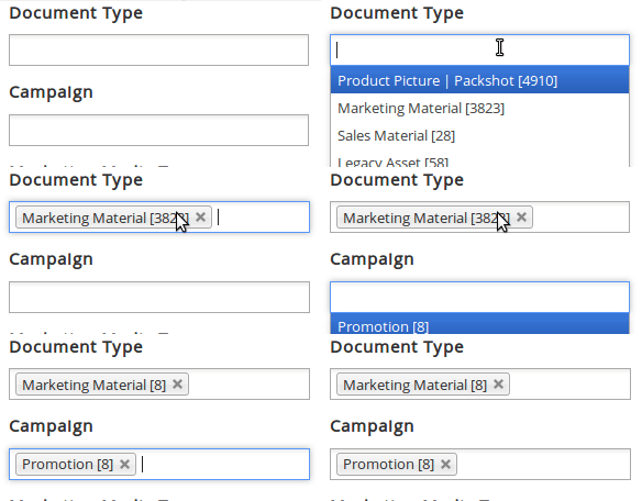
NodeRef-Infofields with style=select and chosen

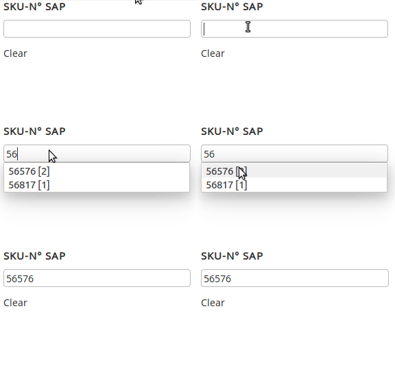
NodeRef-Infofield with style=text

Events
- anura-init-search (options) - triggered after the plugin is done loading the user interface
- anura-init-
infofield-id(options) - triggered after an informationfield widget is done loading (independent of anura-init) - anura-loaded (options, assets) - triggered after a search has been executed
- anura-facet-update (facet-data) - triggered when the faceted search receives new data
- anura-reset (options) - triggered when the user clicks on the "reset search" button
Triggers
- reset(boolean doSearch) - resets the search form, optionally also performs an "empty" search, since 2.9
- set-search-text(String term) - sets the full text search to term and triggers a search, since 2.9
DOM
<div class="anura-search-container anura-locale-en">
   <input type="text" class="anura-search-text">
   <fieldset class="anura-search-type">
      <legend>Type</legend>
      <input type="checkbox"><label>Images</label><br>
      <input type="checkbox"><label><!--etc--></label>
   </fieldset>
   <fieldset class="anura-search-keywords">
      <legend>Keywords</legend>
      <div class="anura-search-keyword-tree">
         <!-- anura-tree-container -->
      </div>
   </fieldset>
   <fieldset class="anura-search-infofield">
      <legend>Usage rights</legend>
      <input type="radio"><label>freely available</label><br>
      <input type="radio"><!--etc--></label>
   </fieldset>
   <input type="button" value="Search" class="anura-search-button">
   <a class="anura-search-reset">Clear</a>
</div>
Breadcrumbs
Options
Provides breadcrumbs based on an anuraTree's selection (e.g. [Earth > Europe > Switzerland])
| Name | Example | Default | Comment |
|---|---|---|---|
| tree | myTree |
null | the anuraTree to listen on (from the $.anuraTree call) |
| multiMode | 'global' |
'local' | when to switch to multi-mode (tags instead of hierarchy), one of: "local" (per tree), "global" (over all trees) or "always" |
| callback | function(server, kind, id, name) {...} |
null | called when a node/leaf is clicked |
Events
- anura-clicked (server, kind, id, name) - triggered when a user clicks on a breadcrumb link
DOM
Classic:
<ul class="anura-breadcrumbs-container">
   <li class="anura-breadcrumb anura-breadcrumb-levels anura-breadcrumb-level-0"><a data-id="3">World</a></li>
   <li class="anura-breadcrumb anura-breadcrumb-levels anura-breadcrumb-level-1"><a data-id="32">Europe</a></li>
   <li class="anura-breadcrumb anura-breadcrumb-levels anura-breadcrumb-level-2"><a data-id="42">Switzerland</a></li>
</ul>
Multi-Mode:
<ul class="anura-breadcrumbs-container">
   <li class="anura-breadcrumb anura-breadcrumb-multi"><a data-id="42">Switzerland</a></li>
   <li class="anura-breadcrumb anura-breadcrumb-multi"><a data-id="1337">Cheese</a></li>
   <li class="anura-breadcrumb anura-breadcrumb-multi"><a data-id="4123">AOC</a></li>
</ul>
© brix Solutions AG