anura-lightbox
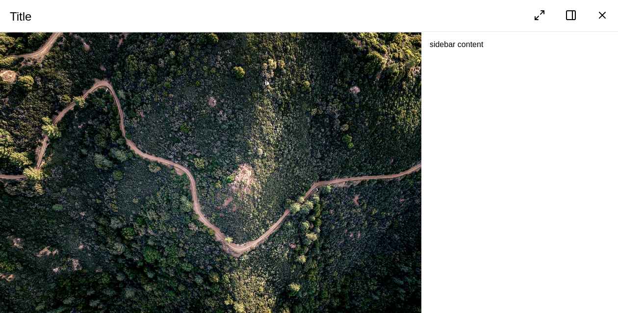
Full-screen component to view bigger previews and asset metadata.

Attributes
asset
required: depends, live: yes, default: set by a main view
Which asset (ID) to display in the lightbox. Opens the lightbox should it be closed . When using it in a slot, the parent component will inject this at runtime (most likely when the user clicks on an asset in the main view). This is set automatically by any main view you might use.
<anura-lightbox asset="123"></anura-lightbox>
adapter
required: depends, live: yes, default: automatic
Needed when using the lighbox without a connected main view (gallery/table/etc.). Referenced or auto-generated lightboxes will get it set by their main view.
<anura-lightbox adapter="#my-adapter"></anura-lightbox>
sιdebar
required: no, live: no, default: true
Disables the built-in sidebar meant for viewing metadata. Possible values:
hidden- hides the sidebar initially, but users can still toggle it via the button in the toolbar.false- removes both the sidebar and the toggle button from the toolbar.
<anura-lightbox sidebar="hidden"></anura-lightbox>
buttons
required: no, live: yes, default:
sidebar, close
Which buttons to show in the toolbar, and in which order. Known buttons:
close- closes the lightbox. Usually specified at the very end.sidebar- sidebar toggle. Only applicable when not removed viasidebar.fullscreen- request the main part of the lightbox to become fullscreen.prev- go to the previous assetnext- go to the next assetslideshow- starts a slideshow (automatically advance to the next asset everysklideshow-millis)basket- add the asset to the download basket (see anura-basket)download- downloads the asset in the defined quick-download formatshare- share link, adds the current (stateful) URL to the clipboard
<anura-lightbox buttons="fullscreen,sidebar,close"></anura-lightbox>
nav-inline
required: no, live: no, default: true
Disable the inline navigation buttons (floating over the image) by passing false. Consider adding prev and next to buttons if you do so.
<anura-lightbox nav-inline="false"></anura-lightbox>
nav-click
required: no, live: yes, default: true
Disable the click navigation on the image (clicking to the right triggers "next", on the left "previous").
This is disabled on mobile, as it interferes with the swipe gesture
<anura-lightbox nav-click="false"></anura-lightbox>
nav-keys
required: no, live: yes, default: true
Disable keyboard navigation when lightbox is open. Mapped keys:
esc,q- close the lightboxleft arrow,h- go to the previous assetright arrow,l- go to the next assets- toggle the sidebar
<anura-lightbox nav-keys="false"></anura-lightbox>
quick-download
required: no, live: yes, default: selection dialog
Which download format to use for the download button. The chosen format must be available on all assets.
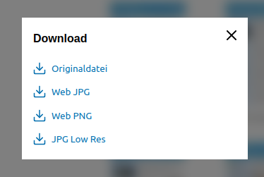
If none is specified, the DAM will be queried. If only one format is available, the download will start immediately - otherwise a selection dialog is shown:

<anura-lightbox quick-download="Original"></anura-lightbox>
slideshow-millis
required: no, live: on-start, default: 5000
How many milliseconds to wait in the slideshow until advancing to the next asset
<anura-lightbox slideshow-millis="7500"></anura-lightbox>
autoplay
required: no, live: on-change, arguments: none, default: not present
Whether <video>s should start playing automatically.
<anura-lightbox autoplay></anura-lightbox>
title
required: no, live: on-load, default: asset.name
Overrides the title of the lightbox - string interpolation is supported.
<anura-lightbox title="${asset.metadata[title].value}"></anura-lightbox>
id
required: no, live: on-load, default: detail
The regular id attribute is used to differentiate multiple lighboxes, should there be any. The primary use-case is deep links, e.g. setting the id to "foo" will generate a deep link "foo-asset" when the lightbox is open (url#foo-asset=1234).
<anura-lightbox id="my-lightbox"></anura-lightbox>
legacy-state
required: no, live: on-load, default: -
Previous versions of anura didn't consistently differentiate instances, so deep-links may just have been rendered as #asset=... instead of #instance-asset=.... If you need to support such legacy states, set this setting to the previous anchor name, e.g.
<anura-lightbox legacy-state="asset"></anura-lightbox>
aria-hide
required: no, live: on-load, default: -
When specified, an AnuraQuery will be performed and each element will get an aria-hidden="true" when the lightbox opens, and an n aria-hidden="false" when it closes again. This is mostly an a11y-feature. Example: #main-views;
Slots
buttons
required: no, default: -
Add you own buttons to the action menu. Buttons found within are given the assets ID as a value for convenience, e.g.:
<anura-lightbox>
    <span slot="buttons">
        <button onclick="alert('Asset '+this.value)" title="Demo">
            <anura-icon icon="alert-triangle"></anura-icon>
        </button>
    </span>
</anura-lightbox>
sιdebar
required: no, default:
anura-details
Content of the sidebar (when enabled). When displaying an asset in the lightbox, every child node of of the sidebar is informed about the change via the asset Attribute.
<anura-lightbox>
    <anura-details slot="sidebar" override-setting="foo"></anura-details>
</anura-lightbox>

<anura-lightbox>
    <div slot="sidebar">
        my custom sidebar
    </div>
</anura-lightbox>
Parts
<nav part="lightbox-nav">
  <span part="lightbox-title" id="lightbox-title">Title</span>
  <slot name="buttons" id="button-slot"></slot>
  <!-- snip, lots of <button>s like: -->
  <button part="lightbox-button lightbox-button-close">
    <anura-icon part="lightbox-icon lightbox-icon-close"></anura-icon>
  </button>
</nav>
<div part="lightbox-container">
  <main part="lightbox-main">
    <div part="embed-container"></div>
    <nav part="embed-nav">
      <button part="lightbox-button lightbox-button-embed-prev">
        <anura-icon part="lightbox-icon lightbox-icon-embed-prev"></anura-icon>
      </button>
      <button part="lightbox-button lightbox-button-embed-next">
        <anura-icon part="lightbox-icon lightbox-icon-embed-next"></anura-icon>
      </button>
    </nav>
  </main>
  <aside part="lightbox-aside"></aside>
</div>
Variables
--sidebar-width
Width of the sidebar, default is 30%
© brix Solutions AG